Monday, October 27, 2008

2018 World Cup Logo Concept

...my personal take on it. I chose Spain for the host country and tried to display a feel for the country in the design. I choose to keep a soccer ball, stylized, as the main focal point while making it slightly abstract and pleasing to the eyes. The colors are common to Spain as well.

The wordmark was intended to flow with the logo and I purposefully left out the "FIFA World Cup" seen in the previous couple WC logos- I felt a strong logo that is accepted worldwide for the event needs no introduction.


Friday, October 24, 2008

Presidential Campaign Logo: 2012

Just had a little fun with a contest I entered...a logo to represent your campaign if you were to run for the President of the United States.


Tuesday, September 9, 2008

Mercy's Craft

Recent logo for Christian band in central South Carolina.

Jalapeno Bistro

Company logo requested but I never heard back from the client. Certainly a shame, but I am keeping my eyes open.


Raleigh Claims Association

Organization logo in North Carolina from about a month ago. As always, click the thumbnail below to see a larger image with better resolution. The bottom logo was the first draft.


Upper 90 Soccer & Sport

Another company concept logo that was requested.


T.R.U.E.

Did this a while back but never got around to posting it. Following this post will also be a few older things mixed in with some newer projects. It is quite simple but it hit the spot I think.


Thursday, July 31, 2008

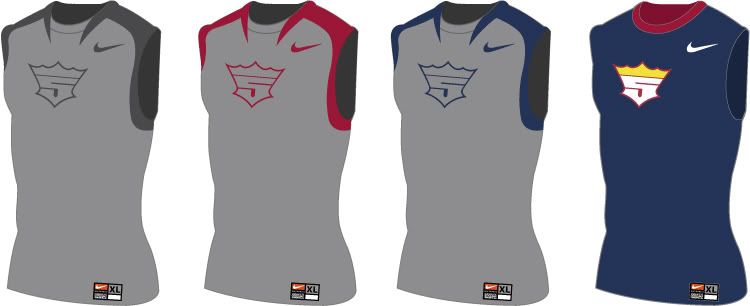
Athlete Product Logo- Albert Pujols

And again, more contest material. The challenge was to create a player logo (think Air Jordan jumpman, LeBron James logo, Tiger Woods logo, etc) for any player that currently is marketable and does not have a logo. You were to also pick a manufacturer (Nike, Under Armour, Adidas, Puma, Reebok, etc) to go along with the logo- including designing articles of clothing and merchandise for the player. Albert Pujols is where I went...best hitter in the majors by most opinions- steriods not included.


Beijing 2008

Another bit of contest/challenge material I am entering for some fun. The challenge was to redesign the official Beijing 2008 Olympic logo. Here, I wanted to go abstract since most great Olympic logos are usually portrayed in this manner.

I wanted something simple that said "China" without overdoing it- so I went to their beautiful architecture...from the ground, 45 degree angle...that good stuff. Also did a b&w version along with a little advertisement/banner.


Thursday, June 26, 2008

Sunco Powder Systems

Logo and variations for Sunco Powder Systems out of Charlotte, North Carolina. I enjoyed creating this logo because I feel it resembles the business Sunco is involved in- it has a bold and simple, while professional, look to it that doesn't go overboard or involve too many elements. Anyhow, if you'd like to check out their site, click here.


Monday, June 16, 2008

More color options...

Optimus

Eh, company concept logo for a contest...still haven't decided on a color scheme for sure yet and while the logo seems simple- to me, it is bold and professional (as always, click it to view larger).