...my personal take on it. I chose Spain for the host country and tried to display a feel for the country in the design. I choose to keep a soccer ball, stylized, as the main focal point while making it slightly abstract and pleasing to the eyes. The colors are common to Spain as well.
The wordmark was intended to flow with the logo and I purposefully left out the "FIFA World Cup" seen in the previous couple WC logos- I felt a strong logo that is accepted worldwide for the event needs no introduction.
Monday, October 27, 2008
Friday, October 24, 2008
Presidential Campaign Logo: 2012
Tuesday, September 9, 2008
Jalapeno Bistro
Raleigh Claims Association
T.R.U.E.
Thursday, July 31, 2008
Athlete Product Logo- Albert Pujols
And again, more contest material. The challenge was to create a player logo (think Air Jordan jumpman, LeBron James logo, Tiger Woods logo, etc) for any player that currently is marketable and does not have a logo. You were to also pick a manufacturer (Nike, Under Armour, Adidas, Puma, Reebok, etc) to go along with the logo- including designing articles of clothing and merchandise for the player. Albert Pujols is where I went...best hitter in the majors by most opinions- steriods not included.
Beijing 2008
Another bit of contest/challenge material I am entering for some fun. The challenge was to redesign the official Beijing 2008 Olympic logo. Here, I wanted to go abstract since most great Olympic logos are usually portrayed in this manner.
I wanted something simple that said "China" without overdoing it- so I went to their beautiful architecture...from the ground, 45 degree angle...that good stuff. Also did a b&w version along with a little advertisement/banner.
Thursday, June 26, 2008
Sunco Powder Systems
Logo and variations for Sunco Powder Systems out of Charlotte, North Carolina. I enjoyed creating this logo because I feel it resembles the business Sunco is involved in- it has a bold and simple, while professional, look to it that doesn't go overboard or involve too many elements. Anyhow, if you'd like to check out their site, click here.
Monday, June 16, 2008
Optimus
Wednesday, May 21, 2008
Kennedy Car Company
This was something I did for fun in a contest a while back...you basically had to create your own car company logo and car series. It had never occurred to me that "Kennedy" could be an appropriate name for a car company...just say it to yourself as if talking to a buddy, "Yeah, I just went to the lot and test drove a new Kennedy kSX." Yeah? No? I think it has a ring to it.
As for the slogan, it basically is a statement that all cars manufactured by Kennedy will come with every option available to consumers and would be the Kennedy standard- no options available. Any Angel investors want to get this going? Without further delay:
Wednesday, April 16, 2008
2008 Gamecock Football Wallpaper
Kinda keeping with the theme I had for the baseball wallpaper, enjoy. If you need a different size, leave a comment and I'll try to get it up.
1280 x 768:
Thursday, March 27, 2008
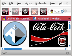
FireCocks Version 1.0
After many requests, I decided to create the first (from my searches) South Carolina Gamecock Firefox theme. If you are already using Firefox, raise your hand...if not, raise your standards. This is the very first version as I am still learning myself how Firefox and its GUI works. For now, the only major changes will be the icons and a tad bit of color- as well as some design/layout changes you may not be used to...slightly "Mac-ish".
The next changes will include light transparent backgrounds, scrollbar edits, and a few other small but noticeable changes.
If there are any problems, let me know by commenting so I can work them out. Even if something seems out of place and you are no expert, let me know- it could be an issue. If you have Firefox Version 2, it should work fine. If you are using the Version 3 beta, it may not work properly- but it will once that is officially released.
Directions:
1. Right click this link and save to your desktop.
2. In Firefox, click Tools>Add-ons.
3. Make sure you are under the "Themes" tab.
4. Drag the FireCocks theme, "FireCocksV1.jar" to that Firefox window.
5. It will begin to install automatically and ask you to restart Firefox.
6. If you bring up Firefox and notice the changes, you are done! Tell me what you think!
7. If you notice no change, go back to the Tools>Add-ons and click "Use This Theme" under the FireCocks theme.
Thursday, February 28, 2008
Vector versus Raster...what's it matter?
Truth is, it matters a lot. From the massive marketing and advertising world to your local tiny shirt printing company...it is a world of difference. When dealing with graphics, you either possess a raster image or a vector image. A raster image can be created with software from Microsoft Paint found right on your Windows PC, or on the widely used (and often abused) Adobe Photoshop. To sum it up, you paint/draw/copy/paste/type until you see what you want on the screen and then you save it. That is where it ends for raster artwork. It is done.
Let's say you personally designed your company's logo on Paint or Photoshop. Looks good when you printed it out, right? Sure it does. Now let's say you want to expand your business and advertise on a huge billboard to gain clients. Think you can send that image to the billboard company and all be fine? Nope. What about printed out on a t-shirt? Probably not. You probably noticed that when you try to scale or resize the logo you created...it loses detail, becomes pixelated, and looks blurry.
That is when vector graphics come to the rescue. While often the difference can not be noticed by the naked eye (as long as the sizes are the same)- the logo looks exactly the same, font the same, colors the same...so why is the vector image better?
The vector image is made up of mathematical equations for each line, stroke, and fill in the logo. Once the logo is created, size has no limit. You can scale the image down to 1/2" x 1/2" or blow it up to 10 ft x 10ft...the clarity, or "resolution" will stay the same. If you wanted to blow it up 1 mile x 1 mile, you could do that as well- it is possible with vector graphic design. Software that allows you to create vector artork includes CorelDraw, Adobe Illustrator, and some others. Adobe Photoshop will not create vector artwork.
Need a visual?
Okay. Let's say you wanted to get a program made for your baseball team and you need the logo for your baseball league. You look online, and all you find is this:
You think, "Awesome, I found it...but it's a little small, so I will resize it." Then you get this:
What a joke you will be if you print that and allow hundreds to thousands of people see it. Even worse if you are the marketing coordinator. You need it in vector format, not only because it will look well- but a printing company NEEDS it in vector to print...it is what their machines understand since behind it all, there is nothing but equations and formulas forming points. Printing companies usually charge a hefty setup fee to convert a raster to vector and even then- they could screw it up because most don't have the proper skills.
You send that aggravating raster image to Apex Media and I give you:
Again, you can resize this image to fit on the side of commercial bus...or fit on a button the size of a quarter. No matter the size, the clarity and "resolution" will be the same.
Football/Baseball Graphics
So obviously a lot of the things I have presented here are Gamecock related. Not-so-obviously, I don't make a dime from any of the work that goes into doing things like this, but I don't mind much. I usually do them from requests from the members over at CockyTalk. They like to use them as signatures on the forums, for their MySpace pages, or their personal web pages. My work is usually complimented which is appreciated a lot, but mainly it gives me more and more practice. Feel free to use these as well.
Monday, February 25, 2008
Gamecock Helmet Concepts
Often I will get requests from members at a Gamecock forum I frequent for helmet ideas...these are a few of them. Take a very close look at the Revolution helmet template itself; its not an image of an actual helmet, but vector artwork itself as well.
Friday, February 22, 2008
Campaign Logo
Subscribe to:
Posts (Atom)